1. PROJECT GOALS AND OBJECTIVES
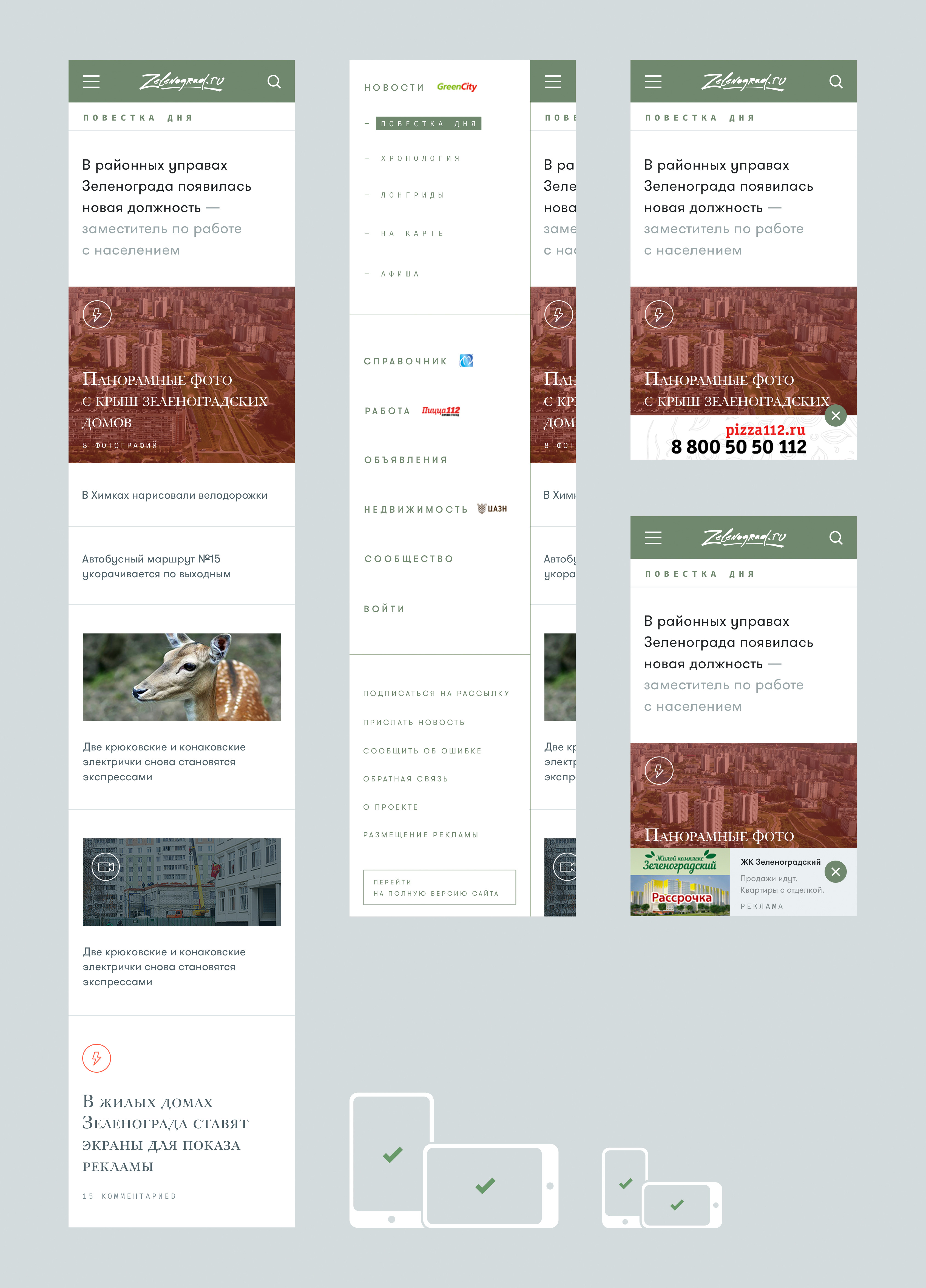
The goal was to customize an existing project to suit the needs of mobile users. It was crucial to make a smooth transition from the existing version to the new one while keeping the advertising options clients had.
The new adaptive design of the website had to meet the following objectives:
- to enhance mobile users’ interaction with the website;
- to build an image of modern new media;
- to provide the editorial staff with wider opportunities for daily news coverage.
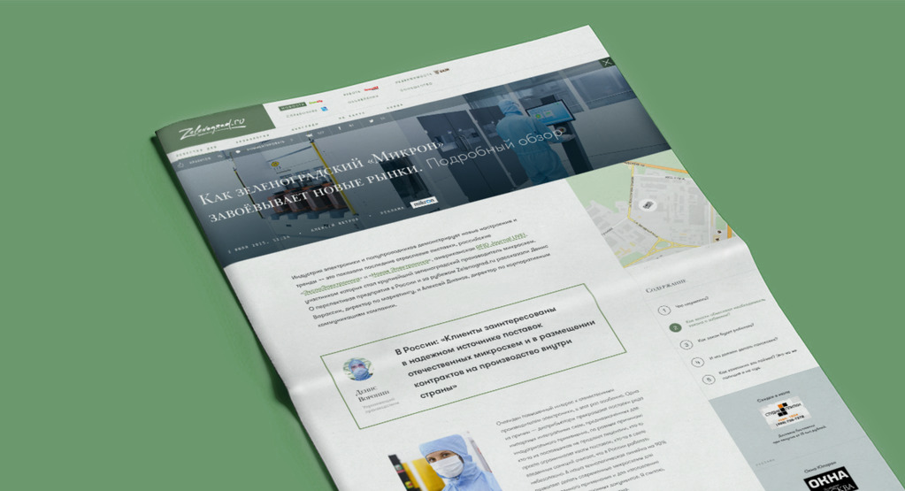
Zelenograd is a city drenched in greenery, a part of the City of Moscow where you won’t find street names (house numbers only). It is known as the Soviet Silicon Valley and a major scientific and industrial center of Soviet/Russian electronics and microelectronics.
Zelenograd.ru is a city web portal with a strong news focus, also featuring a business directory, job listings and ads.
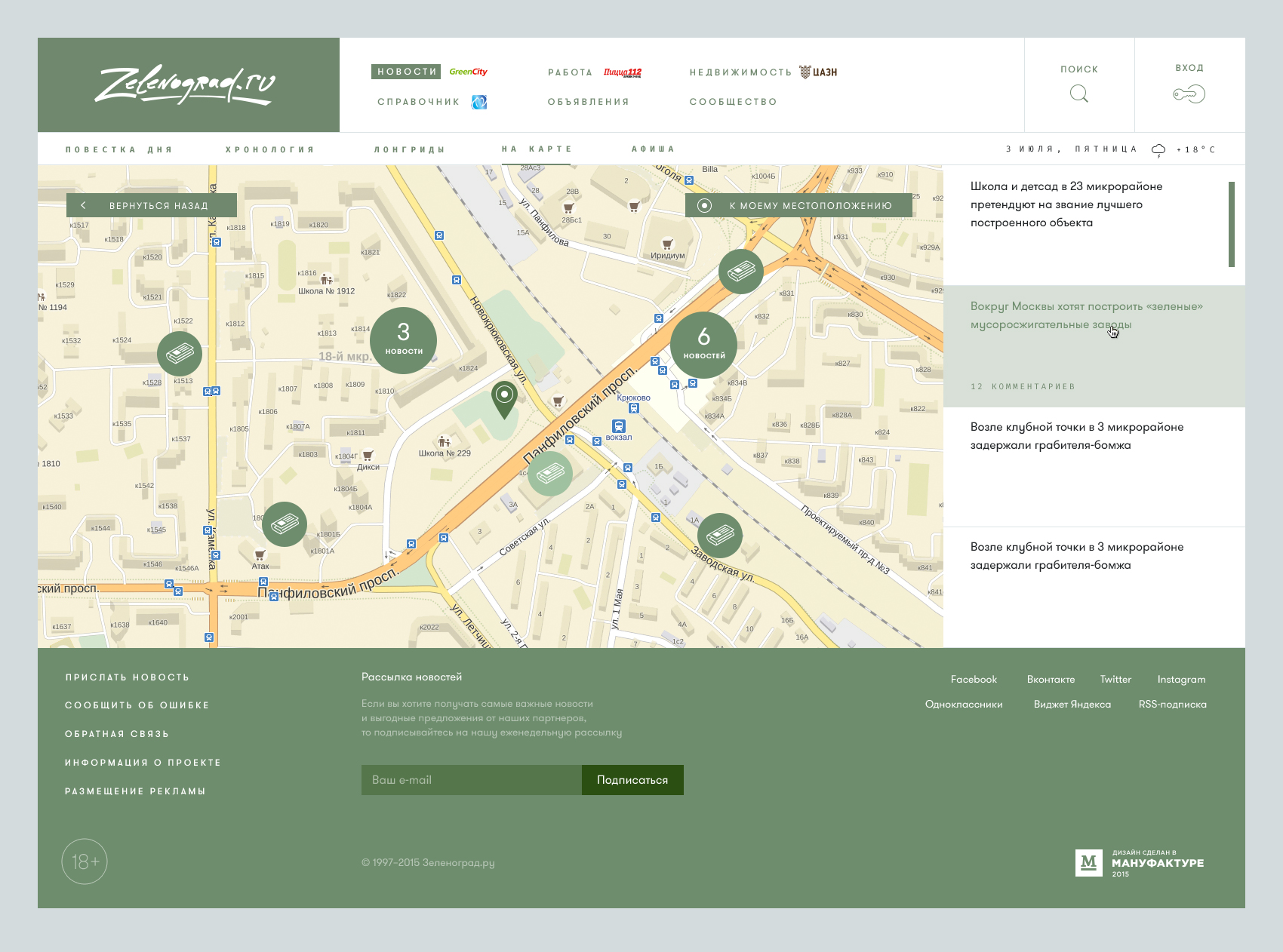
2. RESEARCH
The key requirement for the homepage was its potential for daily news coverage. The number of news items can change from day to day and they can range from important to trivial. Consequently, the news coverage will vary daily, which calls for a flexible homepage, easily adaptable to meet this need.
The solution was a modular adaptive grid. Its blocks fit together to build a masonry-type layout while placed in separate clusters 3 to 4 cells high (depending on the height of the largest element) so that vertical displacement of the blocks wouldn’t affect the chronological order.
We sketched the mockup and discussed it with our client. We were on the right track, as it appeared.

Next, we researched all types of content that could be published on the homepage and structured it. That gave us a clear idea which permanent blocks should be designed for the homepage and what their sizes had to be. As a result, we came up with the layout below.

3. WEBSITE DESIGN
Drawing on our research findings, we established some fundamental principles of interface design and set about creating key pages and elements.

HOMEPAGE
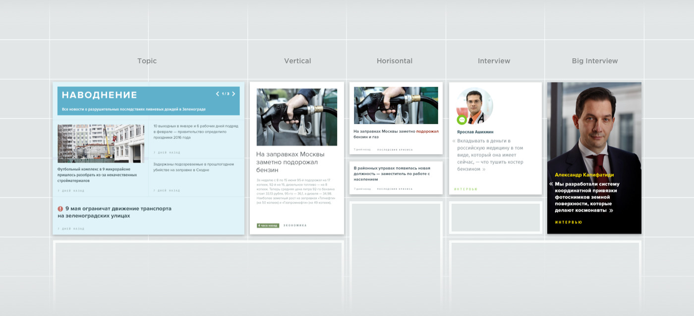
On the homepage we showed the maximum number of ways different block types could be arranged and displayed. The result was a website builder which can meet any requirements the editorial staff might have. Any of the blocks can be used on the inner pages as well. Such flexible approach facilitates media development.
ADAPTING OLD ADS
A very important condition was to keep the existing banner ads. As a matter of fact, their size and look didn’t suit the new design; they were numerous and diverse.
We came up with a solution which wedded the advertisements with the proposed website concept: if you keep the size of a banner ad but place it into a larger cell with some extra space around it, it easily fits in with the new design.

STANDARD BLOCKS AND ELEMENTS OF INTERNAL PAGES
In order to speed up website development and streamline the design process, we created a set of standard blocks which can be used to display any type of content and create any elements of the inner page interface by means of minor adjustments and modifiers following the BEM methodology (Block Element Modifier). Thus, new elements were added to our webpage builder.

Filters

Search

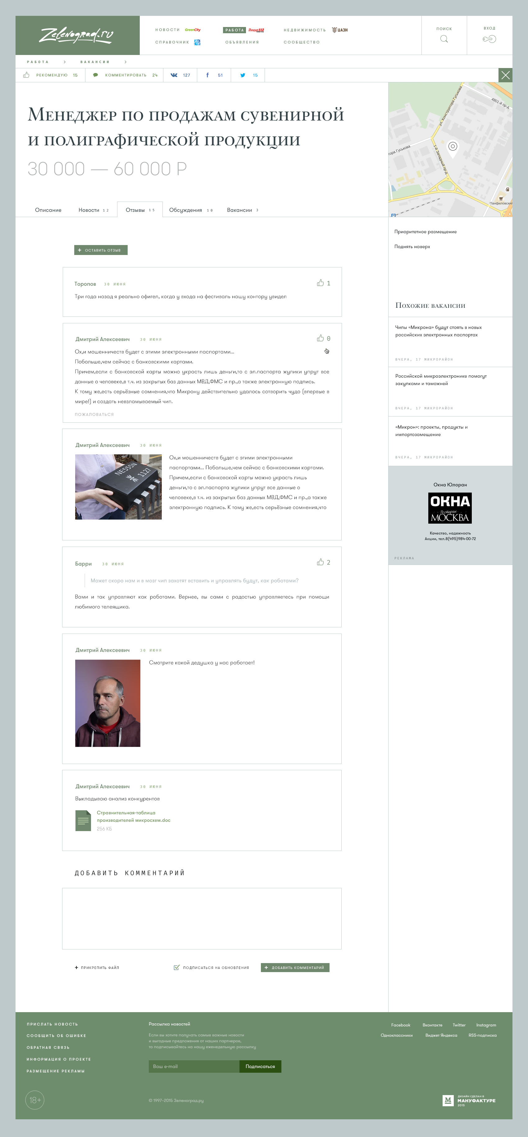
Company description block
Used on business directory pages or, whenever needed, in publications and job postings.

Tabs
An important element of a user account, which can also be a part of a job posting or a real estate object page.

Comments and quotes


Voting, List and Category
Widely used on both the homepage and inner pages.

Social media buttons

Table with filters
STANDARD MODULAR PAGES
Standard blocks are elements that standard webpages are constructed of. Such pages are easily modified and can be used as templates for a few different pages that serve various purposes but are inherently similar. For example, a publication page can also be used to build a discussion page and feature the title, the text of the publication, and user comments.


MOBILE VERSION
Since we used a modular grid composed of gradually diminishing cells, the website was easy to optimize for mobile devices. To do this, it was enough to show only the general principles of element scaling.

4. FRONT-END DEVELOPMENT
The modular structure of the site pages and the grid-based layout with blocks enhanced by the BEM methodology enabled us to quickly build new pages based on previously developed elements. That gradually reduced the time required to code other sections. When creating a great number of blocks of the same type, the use of the BEM template engine brings numerous benefits.
For instance, we had to offer several mockups of the news headlines display. To do this, we created just one news headlines block with modifiers responsible for displaying certain parts of the block. This is very handy - it eliminates code duplication, makes your code reusable and easy to scale.
The BEM structure and naming conventions standardize the code and the entire project file system architecture. They make it more informative and understandable. Another specialist – or a few – can easily join the project.
The template engine saves you the bother of writing long html tags and enables you to write the code in an easy-to-read bemjson or bemhtml format instead, speeding up web development and making it even more enjoyable.
The major challenges we encountered at the integration stage were mostly unexpected issues which came up while the website was being filled with content. There is a lot of miscellaneous content there, and addressing all the bottlenecks at the development stage wasn’t feasible. This is exactly why we offer post-launch warranty, part of which was assisting the client in web integration.
BEFORE AND AFTER
Let's have a look at this project before and after.

Our solution to switch from one type of banner ads to another was a good one. The modular layout allows placing banner ads anywhere on the site even without changing their old look. The clients are not affected by the interface update. What’s more, when the banner ads become less numerous and improve in quality, the website will be ready for that. The project finance model does not suffer from an update either.
As for the website aesthetics, check it out and judge for yourself.